‘Contact Us for Pricing’ Is Not a Pricing Page
Your pricing page is either qualifying your best prospects or sending them away. Here's how to make sure it's doing the former.
TL;DR: Most MSP websites have a pricing page problem, and it's not that they're showing too much. It's that they're showing nothing useful at all. A prospect who lands on your pricing page has already decided they're interested; they're trying to figure out if they can afford you and whether you're worth it. When the page can't answer those two questions, they don't call to ask. They go find someone whose page can. A pricing page that actually works filters the wrong prospects out and moves the right ones forward, without you having to be in the room.
Your pricing page is probably the most visited page on your website that nobody on your team has thought carefully about. Most MSPs spend real time on their homepage, their services page, and maybe even their about page. The pricing page gets a contact form and a prayer.
Picture a restaurant with no prices on the menu. Just beautiful descriptions of food and a note at the bottom that says "contact us for pricing." Some people would stay. Most would leave. Not because the food is bad, but because uncertainty feels like a trap, and nobody wants to be surprised when the bill arrives. Your pricing page creates the exact same dynamic, just without the breadsticks.
Here's what makes this urgent: a prospect who lands on your pricing page has already decided they're interested. They're not browsing. They're trying to answer two specific questions: can I afford this, and is it worth it? That's the moment where your page either moves them forward or sends them to a competitor who gave them something to work with. Most MSP pricing pages fail that moment completely, not because the pricing is wrong, but because the page was never designed to do anything useful in the first place.
In a market where most MSP websites look identical, a pricing page that actually communicates value is one of the least expensive competitive advantages available. This post is about what that page looks like and what's standing in the way of most MSPs building one.
Table of Contents
- The Case for Showing Your Pricing (or at Least Getting Close)
- The Most Common MSP Pricing Page Mistakes
- What a High-Converting MSP Pricing Page Actually Looks Like
- The Copy That Does the Work
- What to Do If You're Not Ready to Show Numbers
- One Page. One Job…And Most MSPs Still Get It Wrong
- Key Takeaways
- Frequently Asked Questions
The Case for Showing Your Pricing (or at Least Getting Close)
The debate about whether MSPs should publish prices is real, and there are reasonable arguments on both sides. Here's the honest version: you probably don't need to show exact dollar amounts, but you need to show enough that a prospect can self-qualify without having to book a call first.
The pricing page is your first opportunity to signal that you've thought carefully about fit, not just about getting a meeting on the calendar. A page that shows nothing useful doesn't protect you from bad-fit prospects; it filters out good ones who needed something to work with before they'd commit to a conversation.
Showing price ranges, tier structures, or even just starting prices does something important: it filters. The prospect who sees "$130–$175 per user per month" and thinks "that's too expensive" was never your client anyway. The one who sees the same number and thinks "that seems reasonable for what we need" is now more qualified than they were ten seconds ago. You haven't lost a deal; you've saved both parties the time of a call that was going nowhere.
When tiers are presented clearly, prospects self-select instead of waiting for you to manually qualify them through a discovery process that neither of you had time for in the first place.
The Most Common MSP Pricing Page Mistakes
"Contact us for pricing" as the entire page. This is the digital equivalent of the restaurant with no prices. It signals opacity, not exclusivity. Some prospects interpret it as "we'll quote you based on what we think you can pay," which is not a great first impression. A contact form is fine as a next step; it shouldn't be the only thing on the page.
Listing features without framing value. A pricing page that reads like a technical spec sheet ("RMM, EDR, patch management, help desk, 4-hour SLA") tells a prospect what they're getting without telling them why it matters. Features describe the product. Value describes what the client's life looks like because of it. The page needs both, and most MSP pages have only one.
No visual hierarchy between tiers. When clients can't clearly see the difference between service levels, they default to the cheapest option or leave to find a provider whose packaging makes more sense. Tiers need to be visually distinct, easy to compare, and designed so the middle option feels like the obvious choice. A wall of text with three price points buried at the bottom is not a tier structure; it's a paragraph.
Pricing that doesn't match the rest of the website. If your homepage positions you as a premium, strategic IT partner and your pricing page shows rock-bottom rates, prospects notice the disconnect. The same is true in reverse: premium pricing on a website that looks like it was built in 2014 creates doubt. Pricing pages don't exist in isolation; they borrow credibility (or lose it) from everything around them.
No social proof near the pricing. Pricing is where doubt lives. It's the moment a prospect is most likely to hesitate. That's exactly where a client testimonial, a case study callout, or a concrete result belongs. Social proof next to a price converts better than social proof anywhere else on the page.
Too many options or add-ons listed upfront. Presenting too many choices leads to decision paralysis, where prospects become so overwhelmed by options that they make no decision at all. Your pricing page should present your core tiers clearly and cleanly. Add-ons, à la carte services, and edge-case pricing can live in a separate section or come up in the sales conversation.
What a High-Converting MSP Pricing Page Actually Looks Like
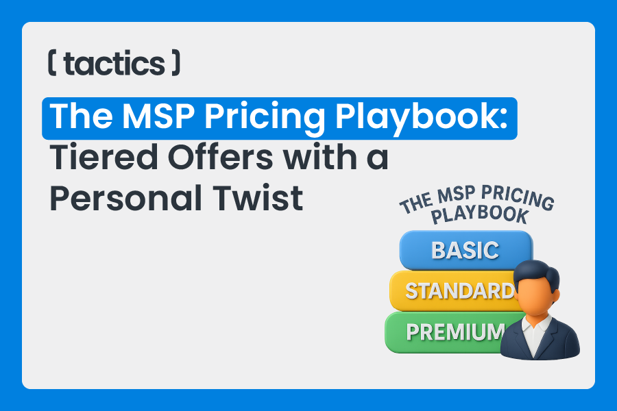
The structure is simpler than most MSPs make it. Three tiers, displayed side by side. Each tier has a name that signals who it's for, a brief description of the ideal client, a list of what's included (benefits-first, not features-first), and a clear price or price range. One CTA per tier, something like "Get started" or "Talk to us about Professional." That's it.
The page leads with the problem, not the product. Something like: "Most businesses are overpaying for IT they don't fully understand, or underpaying for IT that's quietly leaving them exposed. Here's how we structure our services so you get exactly what you need." That framing does two things: it establishes the stakes, and it positions your tiers as a solution to a real problem rather than an arbitrary menu.
Social proof belongs near the price, not just at the top of the page or in a separate testimonials section. A single sentence from a real client placed next to your Professional tier does more work than a carousel of five-star reviews at the top of the homepage. Pricing is where doubt lives; that's where reassurance needs to be.
A FAQ section on the pricing page itself is also worth the real estate. Common questions ("What's not included?" "Do you require contracts?" "What happens if we need more than what's in our plan?") answered directly on the page reduce the friction between "interested" and "booked a call." Every question you answer there is one fewer reason to leave without converting.
The Copy That Does the Work
The language on your pricing page matters as much as the structure. A few principles worth applying before you hit publish.
Lead with outcomes, follow with features. "Your team stays up and running, even when something goes wrong" lands before "24/7 remote monitoring and 4-hour SLA response times." The outcome is why they care. The feature is how you deliver it. Lead with the wrong one and you've already lost the skimmers, which is most people.
Avoid jargon in tier descriptions. EDR, RMM, and vCIO mean something to you. To a 30-person accounting firm, they're alphabet soup. Either define the terms briefly or translate them entirely: "advanced threat detection that catches attacks before they cause damage" is more useful than "EDR included." Your pricing page isn't the place to demonstrate technical depth. It's the place to demonstrate that you understand the buyer.
What to Do If You're Not Ready to Show Numbers
If you're genuinely not ready to publish prices, at minimum do this: show your tier structure without prices, describe each tier clearly, and give prospects a way to get a fast, no-pressure quote. "Our Professional plan starts at $X per user for most businesses" is a starting point, not a commitment. It gives the prospect enough to know whether the conversation is worth having. And if you can show actual numbers, even ranges, do it. The sooner the better.
If you're not sure how to build the tiers behind the page, Your MSP Pricing Is Either Building Your Business or Bleeding It walks through the full pricing framework, including how to structure each tier and what belongs in it. The pricing page is only as strong as what it's presenting.
What you shouldn't do is hide behind "every client is different" as the reason you can't show anything. Every restaurant patron is different too. Different appetites, different dietary restrictions, different budgets. They still put prices on the menu. The menu doesn't close the sale; it just makes sure the right people sit down in the first place. Your pricing page works the same way.
One Page. One Job…And Most MSPs Still Get It Wrong
A pricing page isn't complicated. It needs to show enough that the right prospect can self-qualify, communicate value clearly enough that price doesn't become the only variable, and make the next step obvious. That's it. The reason most MSP pricing pages fail isn't that pricing is hard to present. It's that nobody sat down and thought carefully about what the page is actually supposed to do.
Most prospects who leave a bad pricing page don't send feedback. They just leave. And the ones who stay because the page was vague enough to not scare them off aren't always the ones you wanted anyway. A page built with intention filters, qualifies, and converts. A page built as an afterthought does none of those things quietly.
Tactics works with MSPs on exactly this kind of problem: the gap between how good the service actually is and how well the marketing communicates it. A pricing page that undersells your value, or worse, says nothing at all, is a marketing problem before it's a sales problem. And marketing problems have fixes.
If your pricing page is working against you, let's change that. Get in touch with Tactics Marketing and let's build a page that does the job it was always supposed to do. How known do you want to be? Get Findable.
Key Takeaways
- "Contact us for pricing" is not a pricing page. It's a friction point that filters out good prospects before they ever get on a call with you.
- A pricing page that shows nothing useful doesn't protect you from bad-fit prospects. It filters out good ones who needed something to work with before they'd commit to a conversation.
- Features describe what you offer. Value describes what the client's life looks like because of it. Your pricing page needs both.
- Social proof belongs next to the price, not just at the top of the page. Doubt lives at the pricing tier; that's where reassurance needs to be.
- Jargon on a pricing page doesn't signal expertise. It signals that you wrote the page for yourself, not for your buyer.
- If you can show prices, show them. If you're not ready yet, show your tier structure and get to the numbers as soon as you can.
Frequently Asked Questions
1. Should MSPs publish exact prices or just ranges?
Either works better than nothing. Ranges are a reasonable middle ground: they give prospects enough to self-qualify without locking you into a number before you understand the environment. "Starting at $130 per user" or "$130–$175 per user depending on scope" is honest, useful, and doesn't require you to quote blind. Exact prices work well if your tiers are clearly scoped and you want the sales conversation to start further down the funnel.
2. How long should a pricing page actually be?
Long enough to answer the questions that would otherwise stop someone from booking a call, and short enough that they don't have to scroll for three minutes to find the prices. A well-structured pricing page with a brief intro, three tiers, a FAQ section, and a CTA typically runs one to two screens on desktop. The goal is clarity, not comprehensiveness.
3. What's the biggest mistake MSPs make when they finally add a pricing page?
Building it in isolation from the rest of the sales process. A pricing page that doesn't match your positioning, doesn't reflect your actual service tiers, or sends prospects to a generic contact form instead of a specific next step creates more confusion than it resolves. The page should connect directly to what happens after someone expresses interest. The page ends; the relationship shouldn't.